Take your business to the next level with our result-driven digital marketing, creative strategies, and innovative web solutions. From SEO to social media, we help your brand shine online and reach the right audience.🚀

Responsive Website Development for Seamless User Experience

  • Home
  • Website Development
Android App Development
Request a free consultation with us

Responsive Website Development for Seamless User Experience | Web Tech Digital Solution

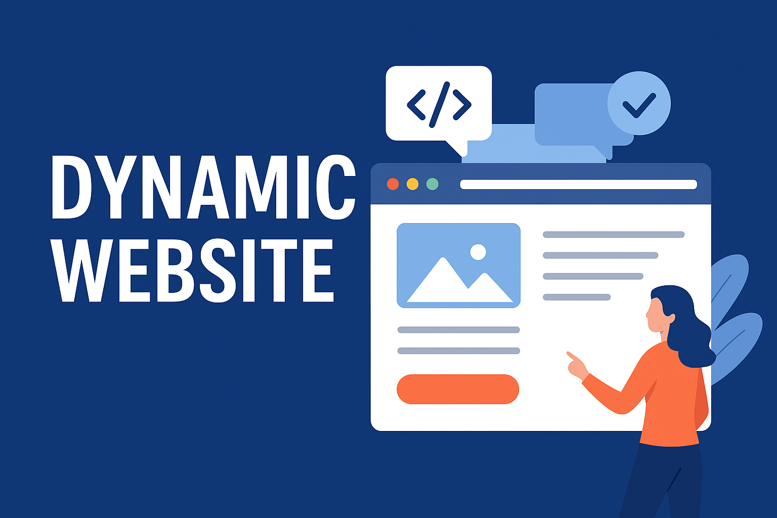
Responsive website development is the process of designing and coding a website so that it automatically adjusts its layout, images, and functionality depending on the device being used. Whether a user visits from a smartphone, tablet, or desktop, the website delivers the same high-quality experience without distortions or usability issues.

Unlike separate “mobile-only” websites, responsive sites use flexible grids, scalable images, and smart coding techniques (HTML5, CSS3, JavaScript) to adapt in real time.

Why Responsive Design is Essential for Modern Businesses

1. Mobile Traffic Dominance

More than 60% of global web traffic comes from mobile devices. A responsive site ensures you never lose customers due to poor mobile compatibility.

2. Improved User Experience

Visitors expect websites to load quickly and function smoothly. A responsive design makes navigation intuitive and hassle-free.

3. SEO Benefits

Google uses mobile-first indexing, meaning mobile-friendly websites rank higher. A responsive website directly boosts your search engine visibility.

4. Cost-Effective

Instead of creating and maintaining separate desktop and mobile websites, a single responsive site works for all platforms.

5. Future Scalability

As new devices with varying screen sizes appear, your responsive site automatically adapts without requiring redesigns.

Web Tech Digital Solution – Building Seamless Digital Experiences

At Web Tech Digital Solution, we don’t just design websites; we create digital experiences that reflect your brand identity and maximize user engagement. Our team of designers, developers, and strategists collaborates to deliver websites that are visually stunning, highly functional, and future-ready. We follow a mobile-first approach, ensuring your website is optimized for smaller screens first and then enhanced for larger ones. This guarantees speed, usability, and consistency across every platform.

Key Features of Our Responsive Website Development Services

When you choose us, you get access to features that ensure your site is efficient, scalable, and user-focused.

Mobile-First Design
  • Prioritizes smartphone and tablet users
  • Readable fonts, tap-friendly buttons, and simplified menus
  • Smooth navigation across all devices
Cross-Platform Compatibility
  • Seamless browsing across Android, iOS, Windows, and Mac
  • Works flawlessly on Chrome, Safari, Firefox, and Edge
  • Adaptability for both portrait and landscape orientations
Speed Optimization
  • Optimized code for faster load times
  • Compressed images and lazy loading
  • Enhanced performance for low-bandwidth networks
SEO-Optimized Architecture
  • Google-friendly responsive coding
  • Structured data and mobile-first indexing support
  • Clean URL structure for better rankings
Modern UI/UX Design
  • Intuitive navigation menus
  • Interactive elements like sliders, animations, and CTAs
  • Aesthetically pleasing layouts aligned with your brand
Scalable & Future-Proof
  • Flexible design for upcoming devices
  • Easy integration with third-party tools (CRMs, payment gateways, etc.)
  • CMS-enabled development for easy content updates
Security & Reliability
  • HTTPS-enabled secure browsing
  • Regular patches and updates
  • Secure coding standards for maximum protection

Our Process for Responsive Website Development

We follow a systematic and collaborative approach to ensure flawless results

  • Discovery & Planning – Understanding your goals, target audience, and competition
  • Wireframing & Design – Creating mobile-first prototypes and layouts
  • Development – Coding with HTML5, CSS3, JavaScript, and responsive frameworks
  • Testing – Cross-device and cross-browser compatibility checks
  • Launch & Optimization – Deploying and fine-tuning for performance and SEO
  • Ongoing Support – Maintenance, updates, and performance monitoring

Our Technologies

HTML

HTML

CSS

CSS

Bootstrap

Bootstrap

JavaScript

JavaScript

jQuery

jQuery

React

React

Node.js

Node.js

Laravel

Laravel

PHP

PHP

MySQLi

MySQLi

MongoDB

MongoDB

Java

Java

Photoshop

Photoshop

Android

Android

Android

Flutter

WordPress

WordPress

Shopify

Shopify

Working Process

Design as Services is way forward

01
Find new ideas
Bring to the table win-win survival strategies to ensure proactive.
02
Analysis
Bring to the table win-win survival strategies to ensure proactive.
03
Prototype
Bring to the table win-win survival strategies to ensure proactive.
04
Test & Launch
Bring to the table win-win survival strategies to ensure proactive.
Pay Now
whatsapp-icon
whatsapp-icon